A good symbol can be drawn from memory and explained in a sentence. SpinDepth's new logo, The Opening, passes the first test easily: it is a dark shape with a slice of light through it. The sentence takes a little longer, because that one shape has four parts worth looking at.
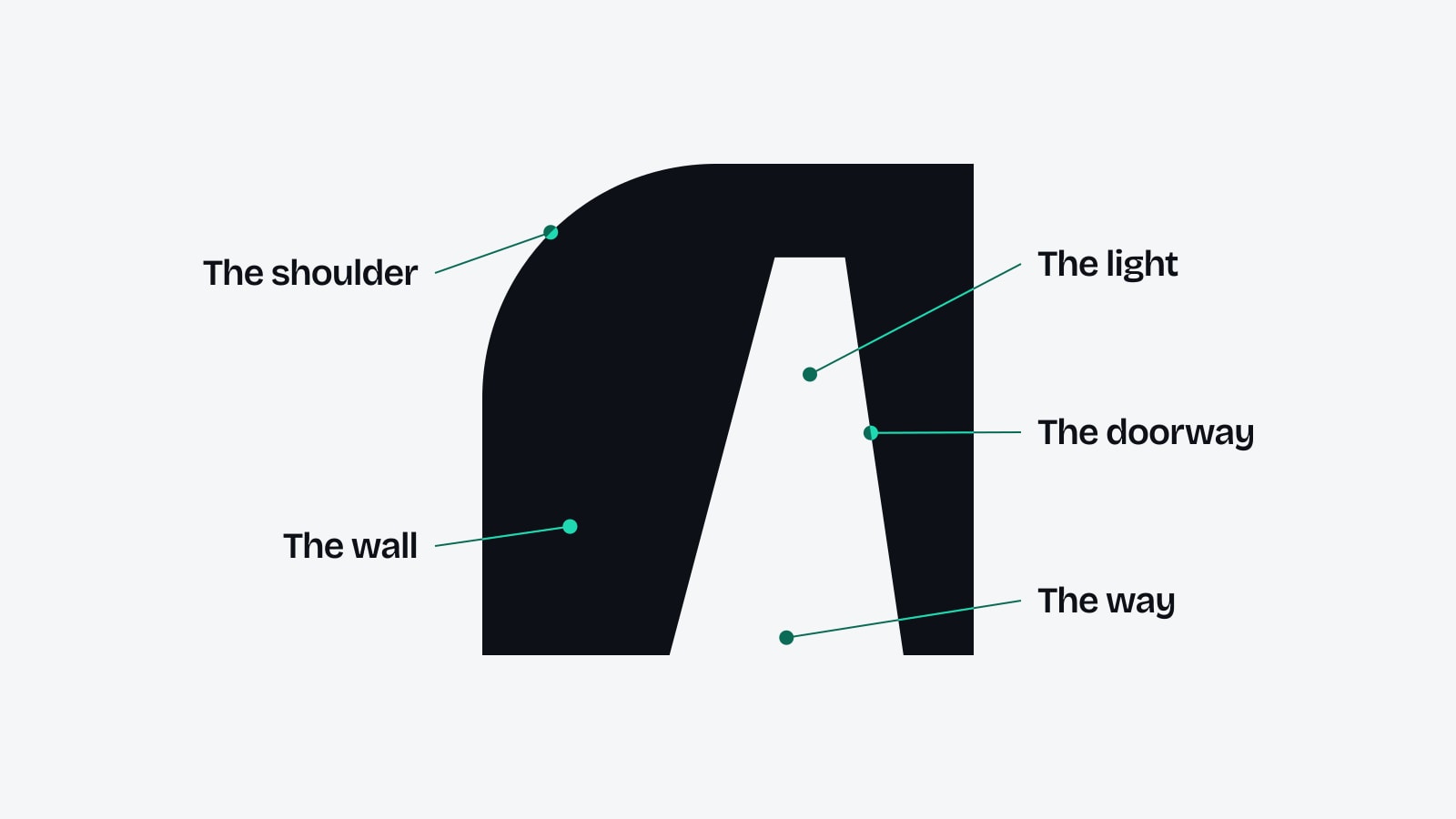
They are the wall, the doorway, the light and the way. This is what each one is, how the symbol is constructed, and what it does when it moves.
The wall
Every brand that enters a new market meets a wall first. The league already has its sponsors. The newspapers already have the names they trust. The audience already has its stars. From the outside there is no obvious place to begin, and spending more does not create one.
The symbol starts with that fact. The wall takes up most of the square. It is solid and heavy, and it sits flat on the ground. It is the market as it looks from outside.
One corner is different. The top left of the wall is rounded into a broad shoulder, the only curve in the drawing. It carries no hidden meaning. It is there as shape: it softens the block, it gives the symbol a silhouette that can be recognised at the size of a fingernail, and it is repeated in the arches that hold photographs elsewhere in the identity.
The doorway
Through the wall there is a doorway. It is not in the middle. It stands to the right of centre, and it is drawn in perspective: wide at the floor and narrow at the top, the way an opening looks when you are walking towards it from one side.
Those are choices of shape, and they do one job. Drawn in perspective and set off centre, the doorway reads as a real way in and not as a flat sign.
The doorway carries the idea the logo was chosen for: SpinDepth has doors into worlds that an ordinary agency cannot simply buy its way into. Its work in media and reputation, football, culture and live experiences is the work of finding that doorway and walking a brand through it.
The light
Nothing is drawn inside the doorway. It is a cut through the wall, so it shows whatever the logo is sitting on. On a white page the doorway is white. On a photograph it is a slice of the photograph. On film it is the moving picture behind it.
We call that the light, and the name comes from the way the logo moves: when it is animated, the opening begins as a single line of light at the hinge. The logo itself never says what is on the other side. It could be a stadium, a studio in Seoul or the front page of a newspaper in Bangkok.
When a second colour is used, the light is the only part that takes it. In the accent version of the logo the doorway is filled with turquoise and the wall stays dark.
The way
Perspective gives a flat shape a direction. Because the doorway narrows as it rises, the eye reads it as depth: something that leads away from the viewer and into the wall. That is the way.
What the way leads to is the firm's actual work. SpinDepth offers several ways into a market, through media and reputation, football, culture, live experiences and advertising, and one team stands behind all of them. The symbol draws a single doorway, and the work behind it takes those routes towards what the tagline calls culture.
The wall is the market as it looks from outside. The doorway is the way in.
How it is drawn
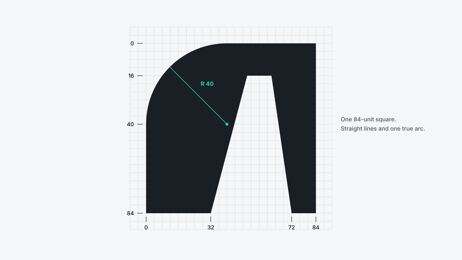
The symbol is built on a square of 84 by 84 units, using straight lines and one true arc. The numbers are simple enough to redraw by hand:
- The wall fills the square, 84 units wide and 84 tall.
- The shoulder is a quarter circle with a radius of 40 units on the top left corner.
- The doorway runs from 32 to 72 along the floor and from 50 to 62 at its top.
- The lintel above the doorway is 16 units deep, and the pillar on the right is 12 units wide at the floor.
A second, simpler drawing is used at 16 to 32 pixels. Its doorway is wider at the top, so the opening does not close up when there are only a few pixels to draw it with. The name beside the symbol is set in Inter Bold capitals with wide spacing, plain letters chosen so that the symbol remains the one distinctive shape.
How it moves
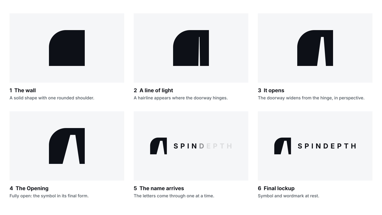
The logo was designed so that it could be animated later without being redrawn, and the animation is the idea itself: the doorway opens. The reveal lasts about two seconds.
It has six steps:
- The wall appears whole, with no doorway.
- A hairline of light appears where the doorway hinges.
- The doorway widens from that hinge, keeping its perspective.
- It stops at the final shape and holds.
- The symbol moves left and the letters of SPINDEPTH arrive one at a time, as if they came through the doorway.
- The finished logo rests.
The rules for motion are as strict as the rules for print. The wall never changes shape, and only the doorway moves. There is no bounce, glow or blur, and the door should feel heavy. Between scenes in a film, the camera can move through the doorway so that the next scene is what was behind it.
What does the SpinDepth logo mean?
The wall stands for a market as it looks from outside. The doorway stands for the way in that SpinDepth provides. The rounded shoulder, the perspective and the off-centre position are choices of shape that make the doorway read as a real way in.
Why is the doorway in the SpinDepth logo off centre?
It is drawn in perspective and set to the right of centre so that it looks like a door someone is approaching from one side, not a door seen straight on.
What is inside the doorway of the logo?
Nothing is drawn there. The doorway is a cut-out, so it shows whatever is behind the logo. In the accent version it is filled with turquoise.
What grid is the SpinDepth symbol drawn on?
A square of 84 by 84 units. The shoulder has a radius of 40 units, the doorway runs from 32 to 72 at the floor and from 50 to 62 at the top, and the lintel is 16 units deep.
How does the SpinDepth logo animate?
The wall appears whole, a hairline of light appears at the hinge, the doorway widens to its final shape and the letters of SPINDEPTH arrive as if through it. The reveal takes about two seconds and the wall never changes shape.
Who designed the SpinDepth logo?
The SpinDepth team designed it. It was introduced in November 2026.
Most people will only ever see a dark form with a bright opening in it, and never think about grids or hinges. That is enough, because the short version is also the true one: there is a way in.
Talk to SpinDepthYou've finished this story
Read on, send it to someone, or ask about it.