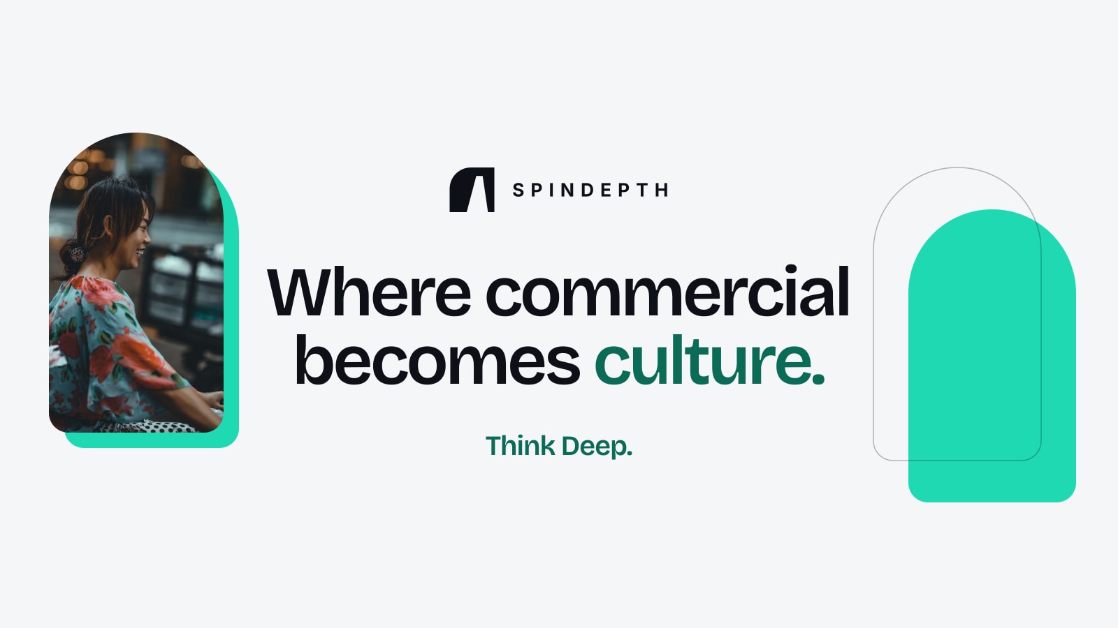
When someone shares a link to spindepth.com in a chat, a feed or an email, a picture appears before anyone reads a word. As SpinDepth's new identity rolls out, that picture changes. It is light where the old one was dark, and it carries five words: Where commercial becomes culture.
That line is the firm's new tagline. This article explains what it means, how the picture around it is built, and why the older line, "Think Deep.", is staying exactly where it was.
What the line means
Commercial is everything a brand pays for: a sponsorship, an advertising placement, a press campaign, a media plan. Culture is what people follow without being paid to: a football club, a drama and the actors in it, a concert, the news they read in the morning. Most marketing stays on the first side of that line. An audience can tell.
SpinDepth works in the gap between the two. A perimeter board at a stadium is a purchase. A football partnership that supporters talk about on the way home is part of the match. A contract with a Korean actor is a purchase. A campaign that fans of Korean entertainment choose to share is part of what they already love. The tagline names the point where one turns into the other.
In every layout the last word, "culture.", takes the accent colour: deep green on a light ground, turquoise on a dark one. It is the word the sentence is travelling towards, so it is the word the eye lands on.

Why there is a tagline and a signature
"Think Deep." was SpinDepth's line before this redesign, and it is not being replaced. The two lines do different jobs. The tagline says what the firm does. The signature says how it works, and it sits beside the name the way a signature sits at the end of a letter.
They are never merged into one sentence, and neither is part of the logo. On the sharing image the tagline is the headline and the signature rests quietly at the bottom, next to the web address. The logo itself, The Opening, stands apart from both.
Commercial is what a brand pays for. Culture is what people keep.
How the picture is built
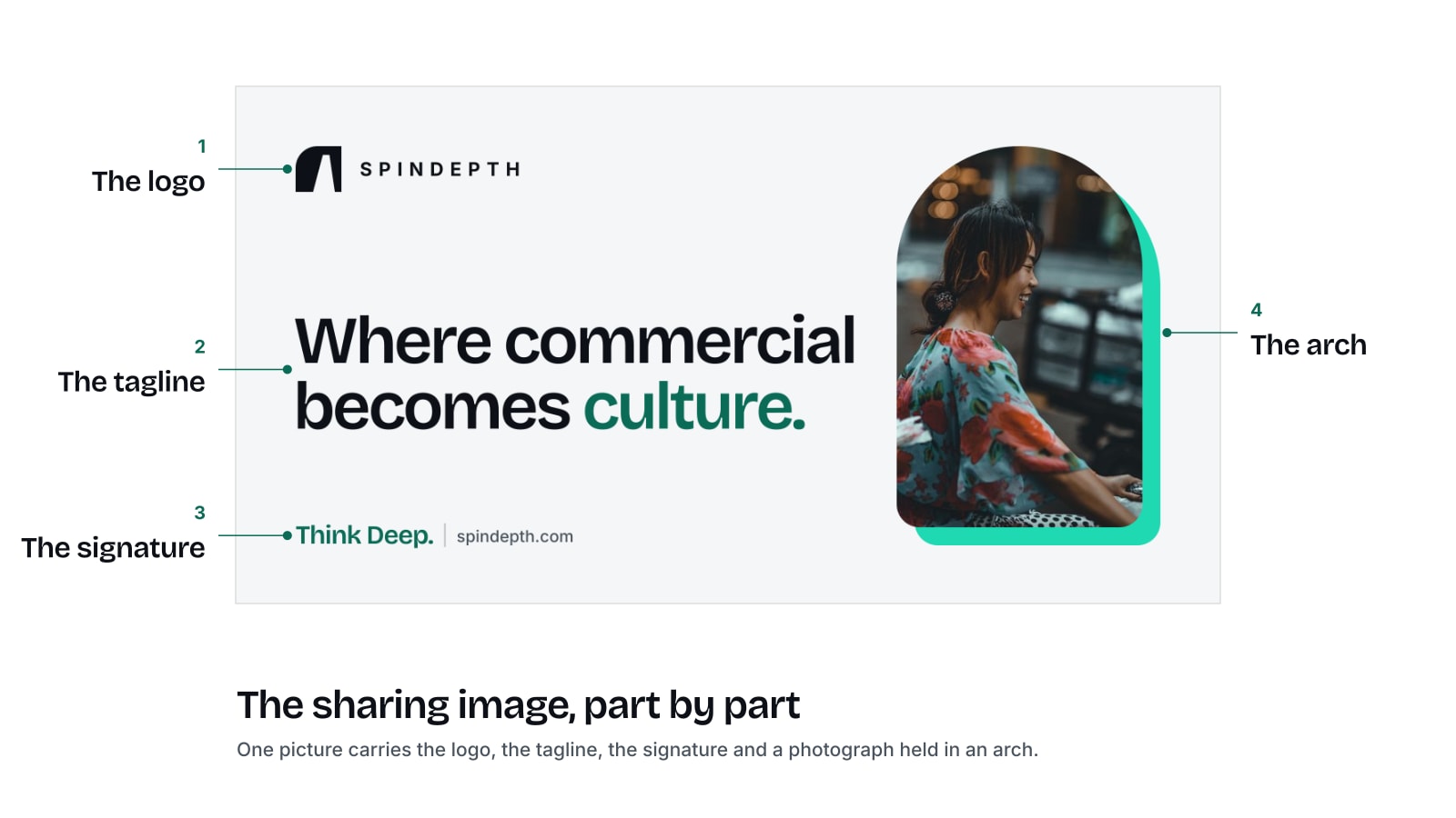
The sharing image has four parts, and each one is placed where a small preview will still show it:
- The logo, top left, small enough to leave room for the words.
- The tagline, set as the headline, the largest thing in the picture.
- The signature and spindepth.com, bottom left.
- A photograph on the right, held in an arch, with a turquoise shape set behind it like a shadow.
The arch is not decoration. It echoes the rounded shoulder of the wall in the logo, so the picture and the symbol belong to the same family without the logo being repeated. The ground is warm white so that the headline stays readable when the preview is the size of a thumbnail in a chat window.
The photograph shows a woman laughing on a street in the evening, with lights behind her. It was chosen because it looks like life and not like a meeting room: culture is made of people, so the picture has a person in it. It is a stock photograph. The person shown is not a SpinDepth employee, a client or a partner.
Where you will see it
The image appears as the preview when a page on spindepth.com is shared and that page has no picture of its own, on messaging apps, professional networks and social feeds. Articles in the newsroom keep their own cover pictures, so a shared story still shows the story.
The same line carries across the rest of the identity. It is the wording on SpinDepth's new LinkedIn cover and YouTube banner, which change by the end of November 2026, and it will close the pages of the redesigned website.
What is SpinDepth's tagline?
"Where commercial becomes culture." It was introduced with the firm's new identity in November 2026.
What does "Where commercial becomes culture" mean?
It describes SpinDepth's work: turning commercial activity such as sponsorship, advertising and press work into things an audience already follows, including football, Korean entertainment, live events and the news.
Is "Think Deep." still used?
Yes. "Think Deep." is SpinDepth's signature. It stays beside the name and is kept separate from the tagline.
Who is the person in SpinDepth's sharing image?
A model in a stock photograph. The person is not a SpinDepth employee, client or partner.
What size is the SpinDepth sharing image?
1200 by 630 pixels, the standard size for a link preview.
A tagline earns its place when it tells a stranger what a firm is for in one breath. Ours says that SpinDepth exists for the moment a commercial plan stops looking like advertising and starts belonging to the people it was made for.
Talk to SpinDepthYou've finished this story
Read on, send it to someone, or ask about it.