A logo and a tagline are usually introduced as two separate things, and then spend years being squeezed into the same corner of every page. In SpinDepth's new identity the two do not compete. The symbol and the sentence answer each other, and a few rules keep them apart.
The symbol is a wall with a doorway. The sentence is "Where commercial becomes culture." One shows that there is a way in. The other says what is waiting on the far side.
The logo shows the way in
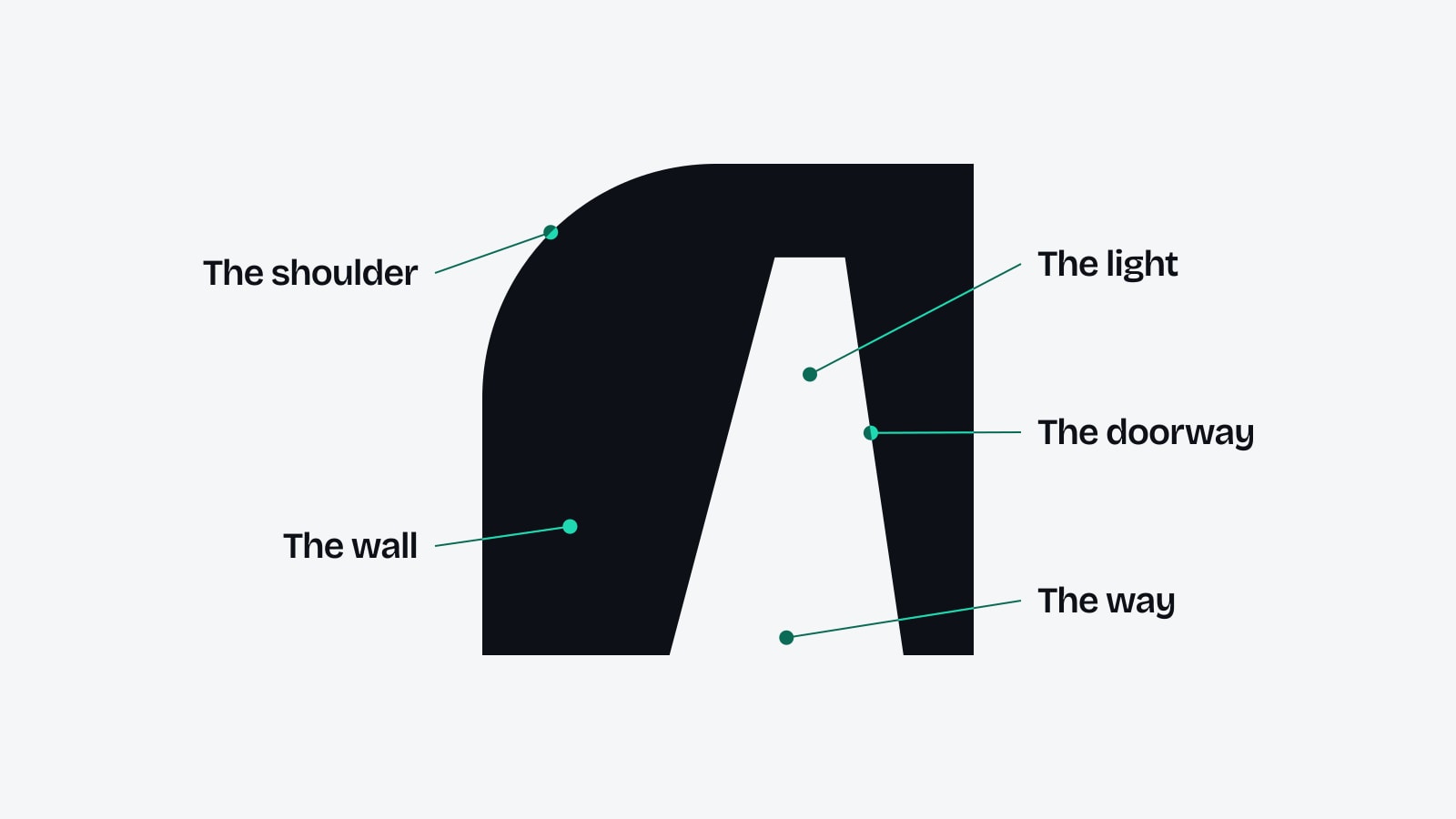
The Opening is a single shape: a solid wall with one rounded shoulder, and a doorway cut through it in perspective. The wall stands for a market that looks closed from outside. The doorway stands for the way through, the part a brand cannot simply buy.
A symbol like that raises a question it cannot answer by itself. A way into what? A drawing can show a door, but it cannot say what is behind it. That is the job of the words.
The tagline says what is on the other side
"Where commercial becomes culture." finishes the thought. Behind the doorway is the place where a sponsorship, a placement or a campaign stops being something a brand bought and becomes something an audience follows: a club, a star, an event, a story in the news.
Read together, the two say one sentence. There is a way into the markets and the audiences a brand wants to reach, and on the other side its commercial plans turn into part of what people already care about. Finding that way is what SpinDepth does.
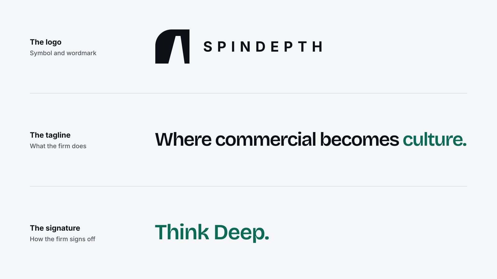
The signature, "Think Deep.", is the third voice. It does not describe a service. It describes a habit: look past the first answer, check what a market really finds when it searches a name, and plan from there. It stays beside the wordmark as the firm's sign-off.
Rules that keep them apart
Because the three elements belong together, it would be easy to weld them into one block. The identity forbids it, for a practical reason. A logo with a sentence inside it stops working when it is small, and a sentence trapped inside a logo cannot be set large enough to be read.
So each element keeps its own space:
- The tagline is never set inside the logo or locked to it.
- A quarter of the symbol's height stays clear on every side of the logo.
- The tagline and the signature are never joined into one line.
- The symbol can appear alone, as it does in a profile picture, but the lines never borrow its place.
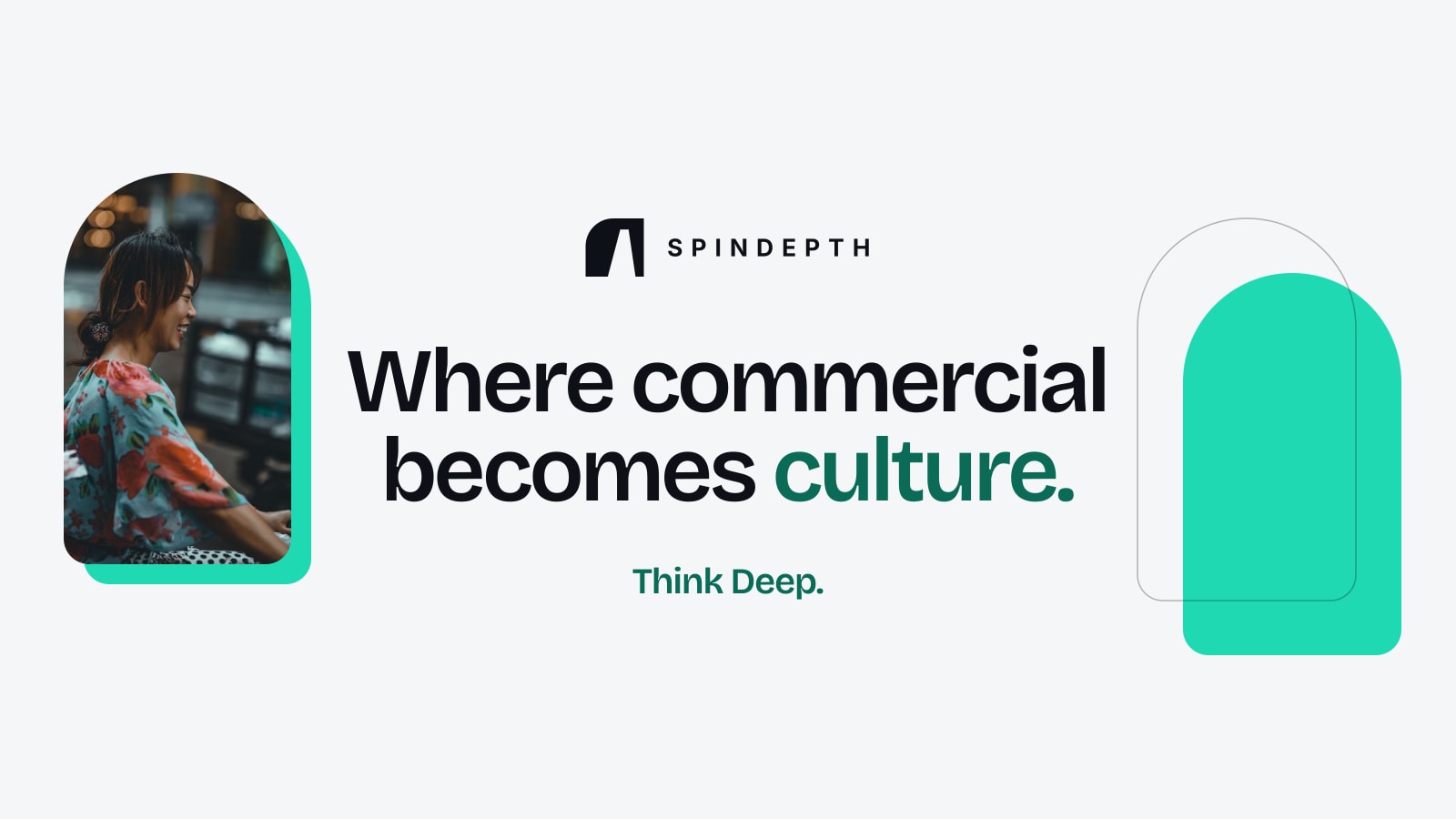
In a typical layout the logo sits at the top left, the tagline is the headline in the middle and the signature rests at the bottom. The sharing image that previews SpinDepth links follows exactly that order.
The symbol opens the door. The sentence tells you what is in the room.
Light first, dark when needed
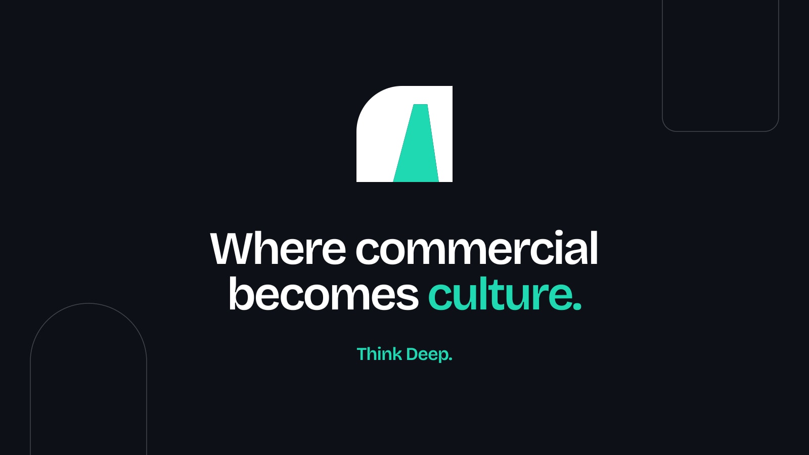
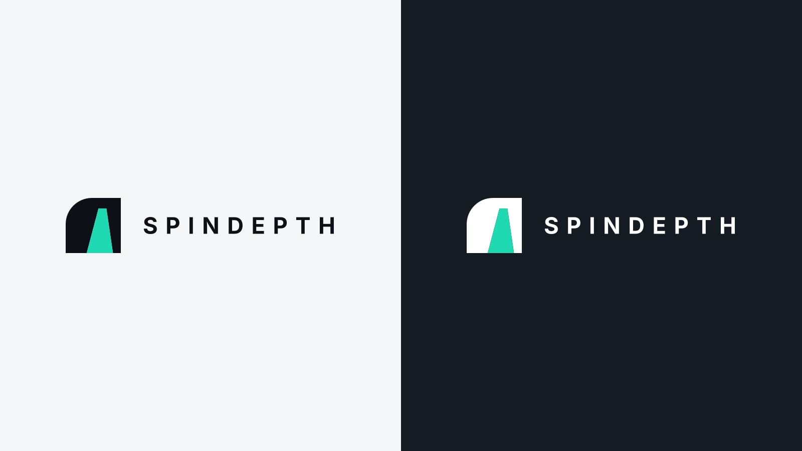
SpinDepth's pages have been dark until now. The new identity is light first: charcoal ink on a warm white ground, which is easier to read at length and prints cleanly. A dark version, white on charcoal, is kept for video, photographs and evening events.
Turquoise remains the accent in both. In the tagline it colours the last word, "culture." In the logo it can fill the doorway, which turns the opening into the brightest point of the drawing.
How do SpinDepth's logo and tagline relate to each other?
The logo, a wall with a doorway, shows that there is a way into a market. The tagline, "Where commercial becomes culture.", says what is on the other side of that doorway.
Is the tagline part of the SpinDepth logo?
No. The tagline is never set inside the logo or locked to it. The logo, the tagline and the signature are three separate elements.
What is the difference between SpinDepth's tagline and its signature?
The tagline, "Where commercial becomes culture.", says what the firm does. The signature, "Think Deep.", says how it works and sits beside the name as a sign-off.
Is SpinDepth's identity light or dark?
Light first: charcoal on warm white. A dark version in white on charcoal is used for video, photographs and events. Turquoise is the accent in both.
Can the SpinDepth symbol be used without the name?
Yes. The symbol appears alone in profile pictures, app icons and browser tabs.
An identity holds together when every part can be explained by pointing at another part. The doorway asks a question, the tagline answers it, and the signature says how SpinDepth gets there.
Talk to SpinDepthYou've finished this story
Read on, send it to someone, or ask about it.