#SpinDepth
4 stories tagged SpinDepth, newest first.
Monday, November 16, 2026
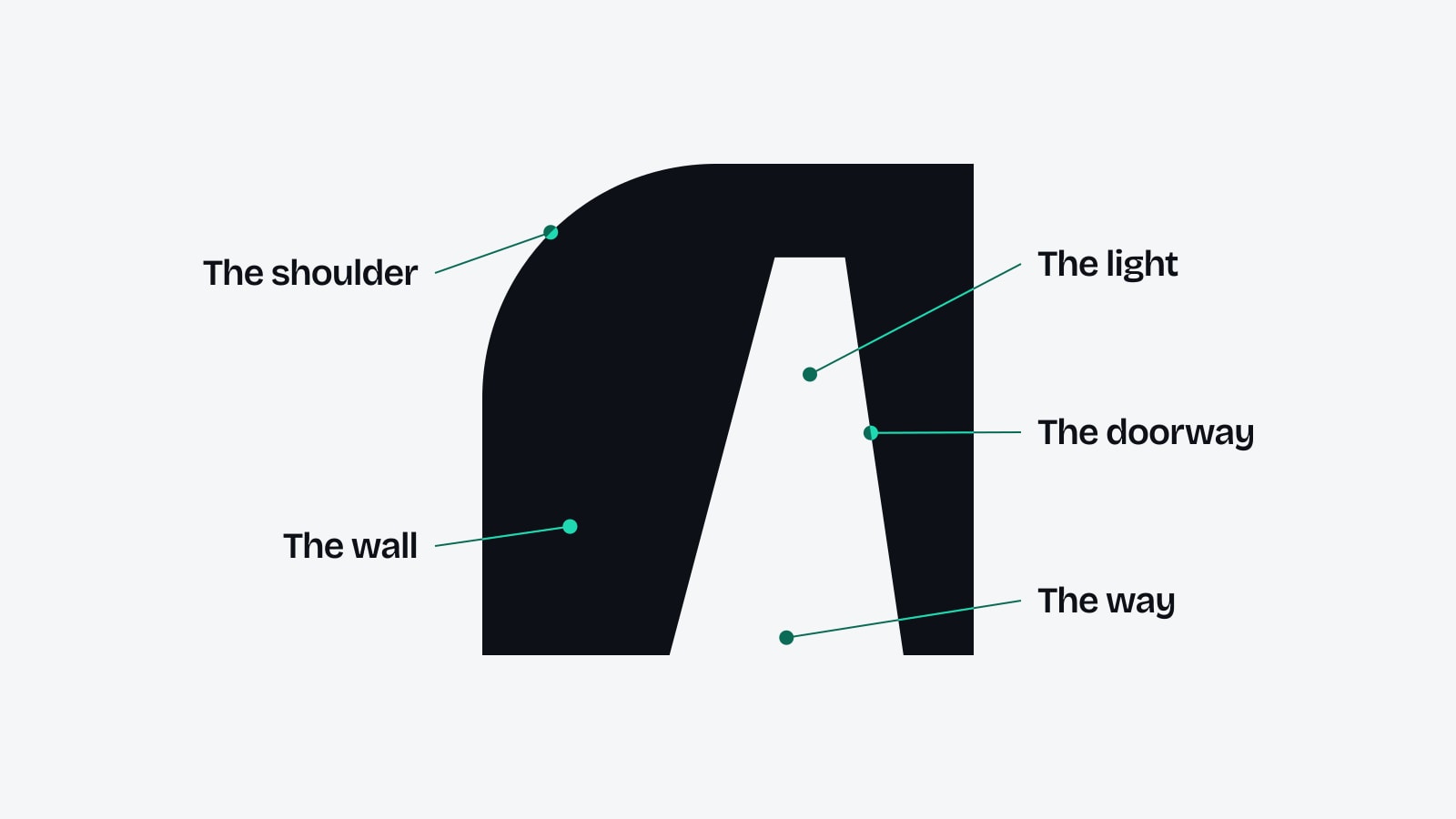
The wall, the doorway, the light and the way: SpinDepth's logo explained part by part
SpinDepth's logo, The Opening, is one shape with four parts worth a closer look. A reading of the wall, the doorway, the light and the way, the grid the symbol is drawn on, and the two seconds in which it opens.
A doorway and five words: how SpinDepth's new logo and tagline work together
The logo shows a way in. The tagline says what is on the other side. A look at how The Opening, "Where commercial becomes culture." and "Think Deep." share one identity without getting in each other's way.
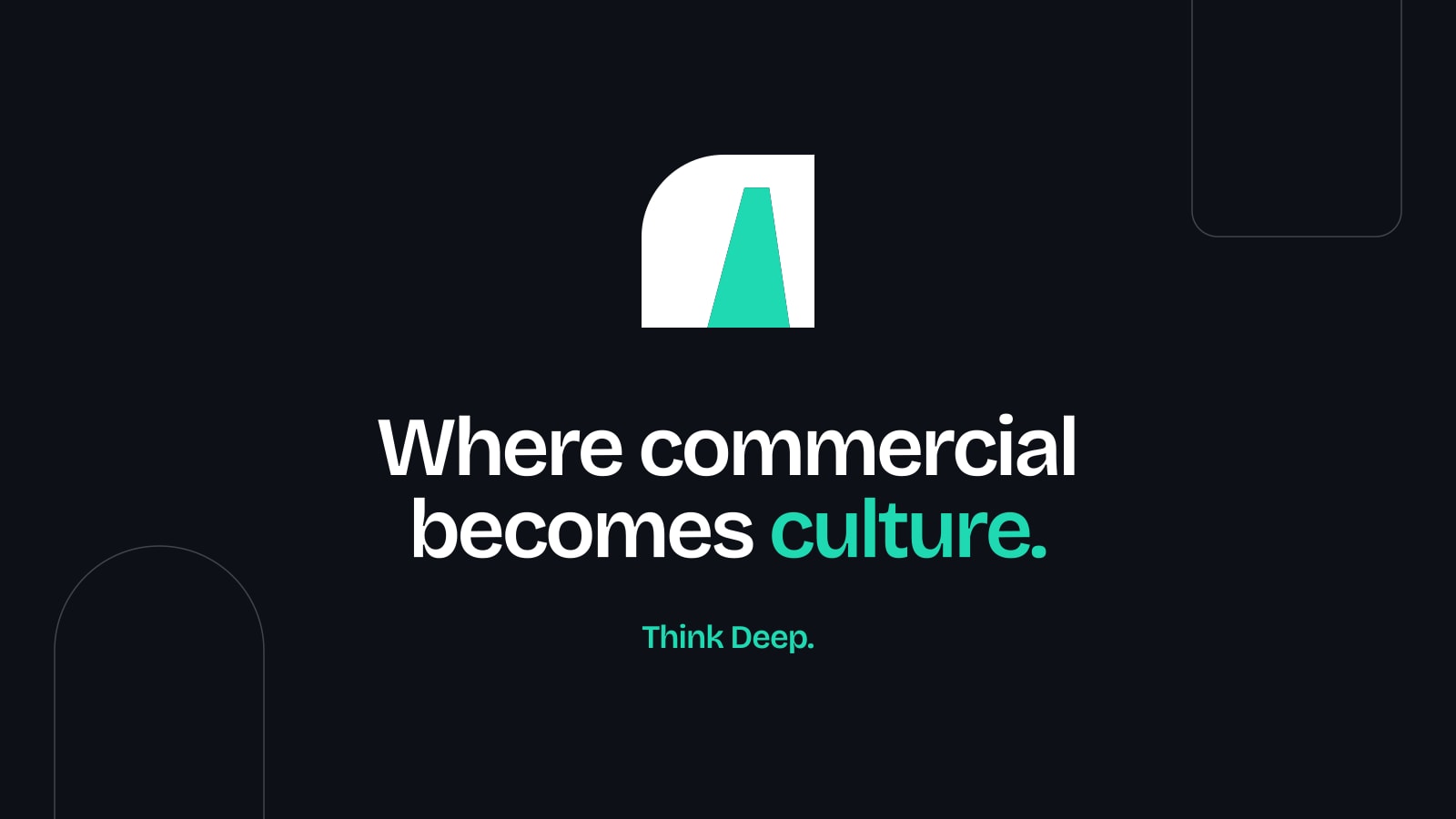
Where commercial becomes culture: the line and the picture that now introduce SpinDepth
Five words now sit at the centre of SpinDepth's identity, and one picture carries them wherever a link is shared. This is what the tagline means, how the sharing image is built and why "Think Deep." stays.
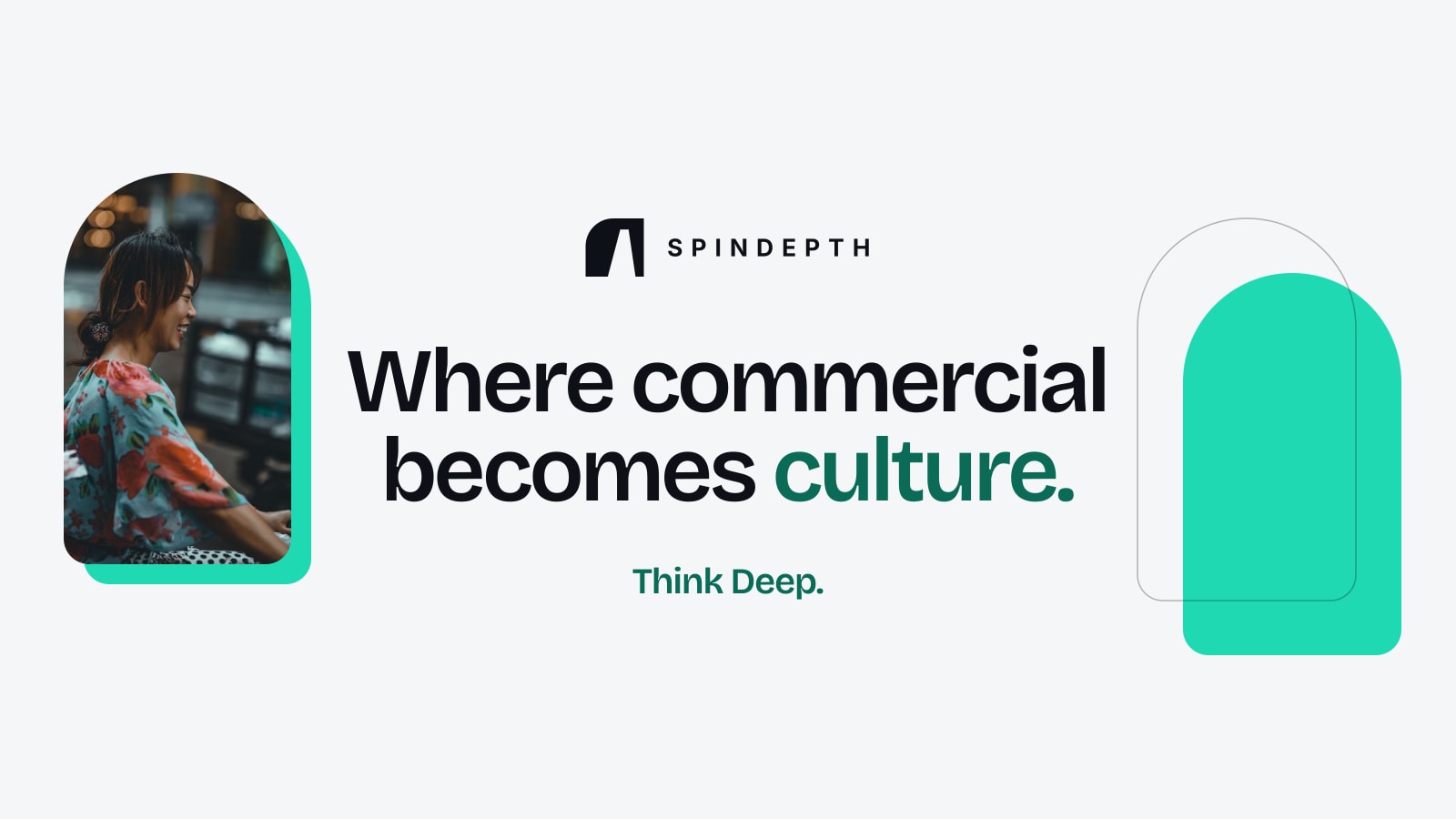
SpinDepth has a new logo. It is called The Opening
SpinDepth's new logo is a wall with one rounded shoulder and a doorway cut through it, set beside the name in bold capitals. Here is what it shows, how it is used and where it will appear first.