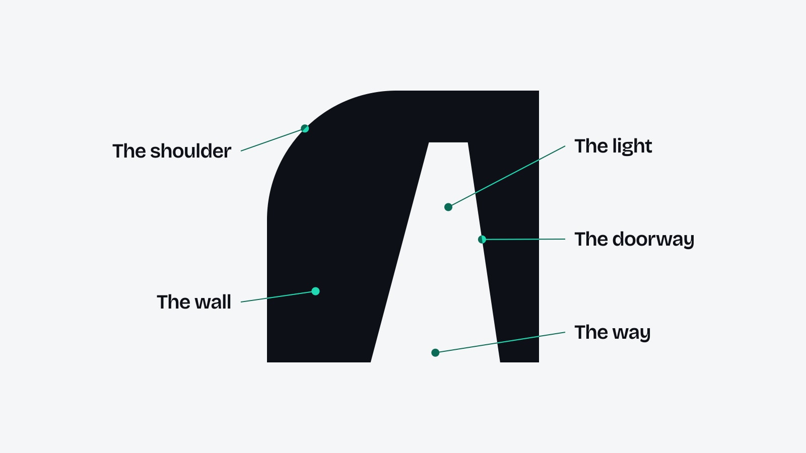
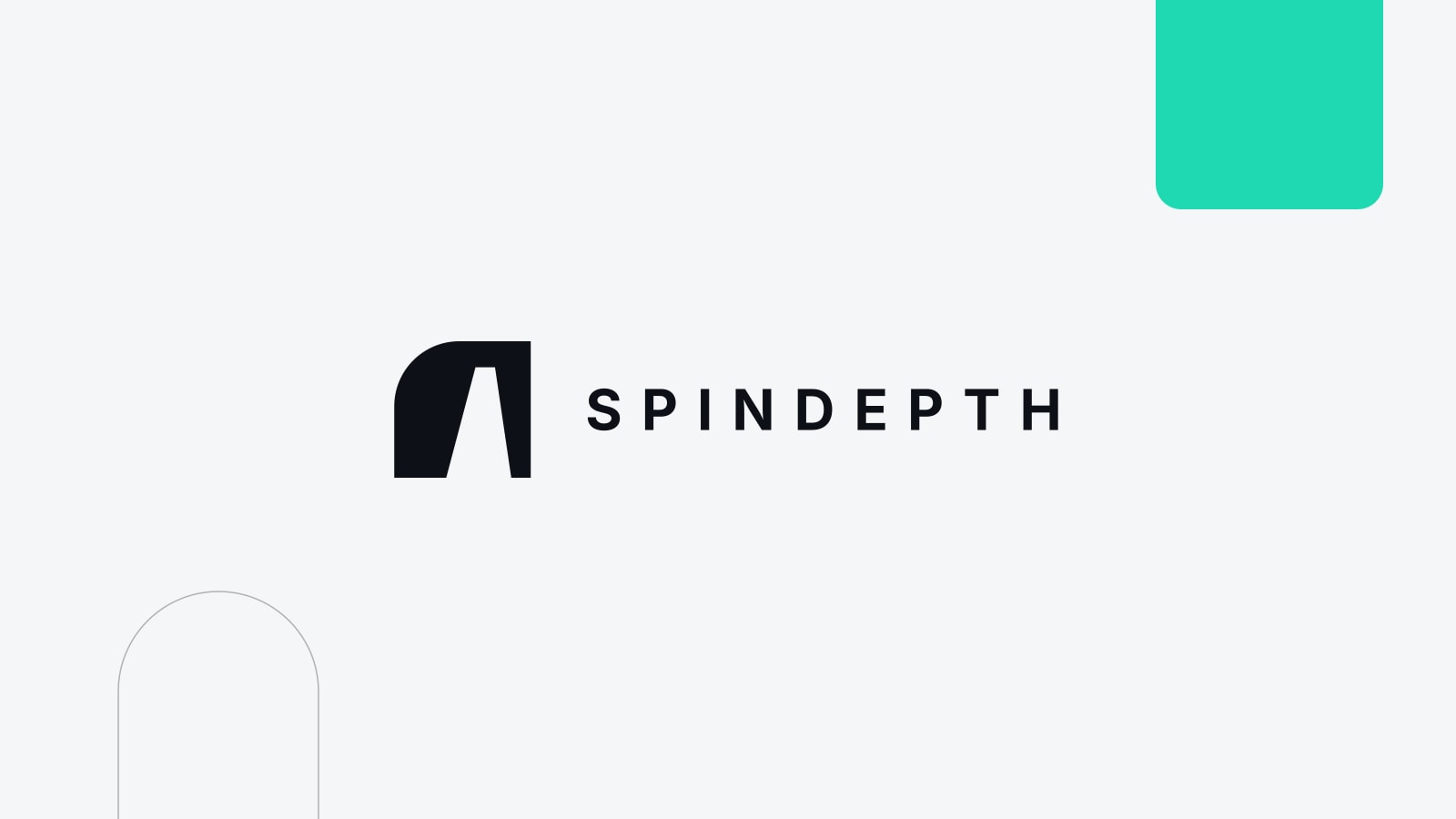
SpinDepth has a new logo. It is one shape: a wall with one rounded shoulder and a doorway cut through it, drawn in perspective and set slightly off centre. Beside it sits the name, SPINDEPTH, in bold capitals. We call it The Opening.
It arrives in November 2026 as the first piece of a new identity for the firm. By the end of the month it will be on our LinkedIn, YouTube and Instagram pages, and this website follows as the rollout continues.
A wall with a way through
Most of our work starts at a wall. A brand wants to be known in a market it does not come from: a football league, a country's press, an entertainment industry with its own gatekeepers. A budget does not open those on its own. Someone has to know where the door is.
The logo draws that moment. The wall is solid and heavy. The doorway is narrower at the top than at the floor, the way a real opening looks when you walk towards it from one side. Nothing is drawn inside it. The doorway shows whatever sits behind the logo, whether that is paper, a screen or a photograph.
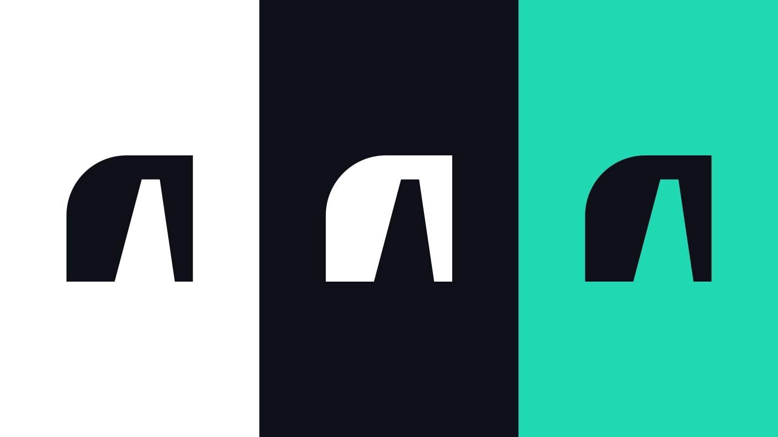
Built to work in one colour
The Opening was drawn in black and white first. It holds as charcoal on warm white, as white on charcoal and as flat black for print. Turquoise, the colour already familiar from this website, stays as the accent and can fill the doorway when the logo needs a second colour.
There are four versions, and each has one job:
- The horizontal logo, with the symbol beside the name, for most uses.
- The stacked logo, with the name under the symbol, for square and tall spaces.
- The symbol alone, for profile pictures and app icons.
- A small drawing with a wider doorway for 16 to 32 pixels, so the opening stays open in a browser tab.
The rules are short. The symbol is never placed in a tile, stretched, outlined or given effects, and a quarter of its height is kept clear on every side. The tagline is never set inside the logo.
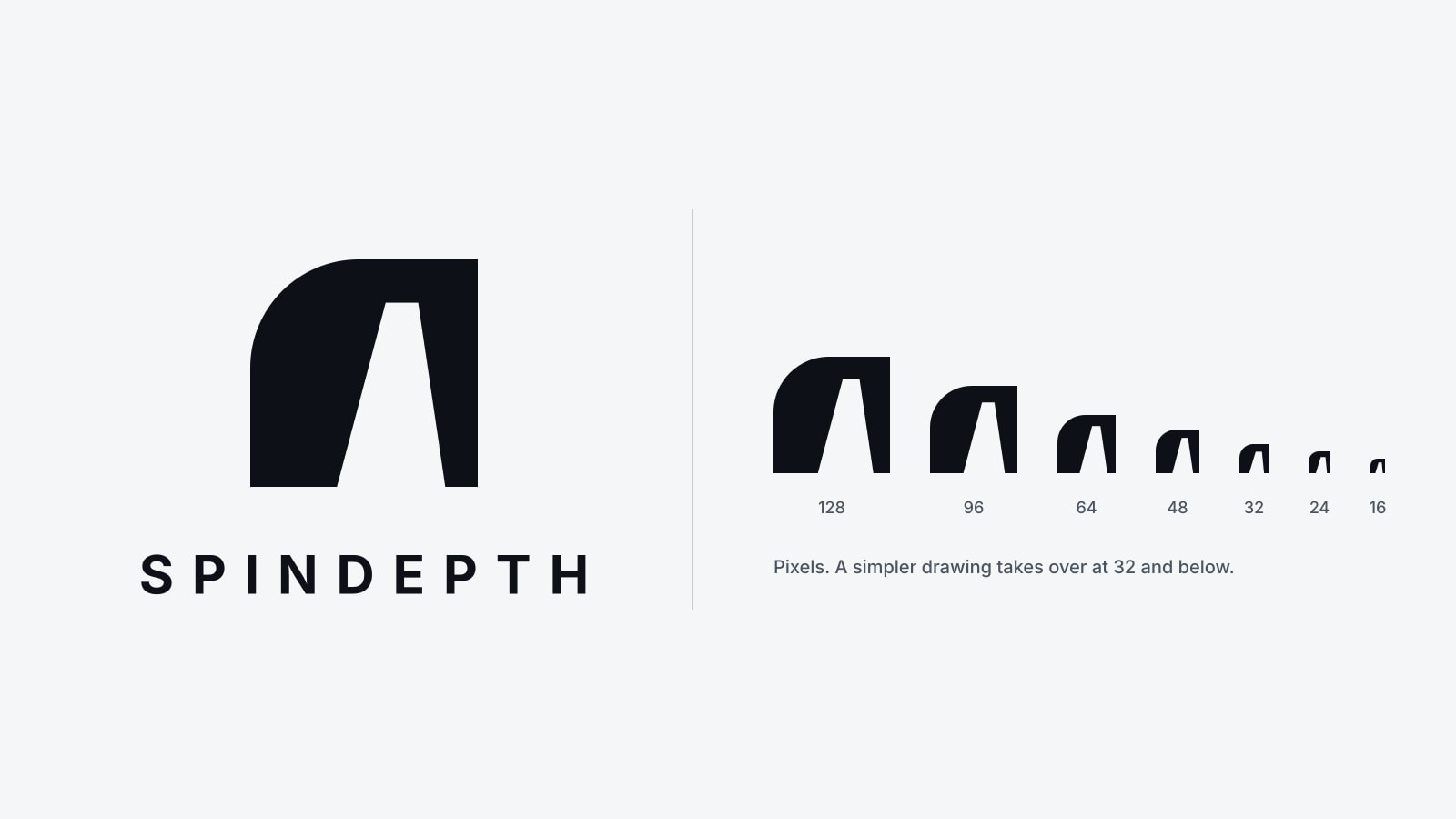
A logo should say one thing. Ours says there is a way in.
What happens next
The SpinDepth team drew The Opening and the identity around it: the colours, the type and the line "Where commercial becomes culture." Each part is explained in its own article in the SpinDepth newsroom today.
If you follow us on LinkedIn, YouTube or Instagram, expect the profile picture and the cover to change by the end of November 2026. The name, the people and the work stay the same, and you can read who we are on the About page.
What is SpinDepth's new logo called?
It is called The Opening. It was introduced in November 2026.
What does the SpinDepth logo show?
A wall with one rounded shoulder and a doorway drawn in perspective, set off centre, beside the name SPINDEPTH in bold capitals. It stands for the way into a market that a brand cannot simply buy its way into.
What colours does the SpinDepth logo use?
Charcoal on warm white, or white on charcoal, with turquoise as an accent. It also works in plain black or white for print.
When will the new logo appear?
On SpinDepth's LinkedIn, YouTube and Instagram pages by the end of November 2026. The website follows as the rollout continues.
Has SpinDepth changed its name?
No. The company is still SpinDepth. Only the visual identity changes.
The Opening is a small drawing with one job: to show that a closed market has a way in, and that finding it is the work SpinDepth does.
Talk to SpinDepthYou've finished this story
Read on, send it to someone, or ask about it.